
|
|
||||


[Alliance] [Guilds] [People] [Places] 

[Categories] [Members' Submissions] [Miscelleanous] [Guild Ranking] 255 [Medals] Information                                                Dino is also an active screenshots contributor. (: See here: Dino |
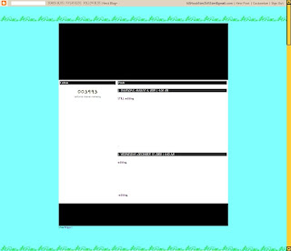
Monday, August 17, 2009 @ 6:39 PM Preview of new template Hello! Another screenshot!  Ok ignore the green colour bits on top; they're meant to be something else. As in, I am going to put a different picture there. But the green bits on the bottom are intentional; in the new template it will be a picture of GRASS! Yay! And the blue...it is meant to show the sky. Not this shade of colour though; a bit too bright. See the black portions near the top and near the bottom? Well, the top is going to be a new header picture! Yay! And the bottom may be the footer; or I may take that away entirely Well, that scrollbar is not going to stay orange, but rest-assured my FFCC33-lovers, I'll find somewhere to place that nice colour =D. This is really just a rough preview, but the template is roughly like this. At first I was thinking of using the area-coord thing (I don't know how to describe it) like our second version:  *Note: I don't use Firefox. This screenshot was not taken by me. (Well, in case you're wondering, our first version was actually the default blog template.) =) Then after that I was thinking of using all tables, like our third version:  After messing up many times I gave up on the idea! Here was what I was trying to do :  A table! (the black white thing in the centre) within a table! (the white border surrounding) I wanted to have a standard background (the orange, perhaps?). Also, do you see the faint white lines along the vertical side of the table? The bits, which are currently orange, are the - ok this is confusing Ahem, let me try again. Okay, let the black white table inside be table 1. Let the orange table behind be table 2. You with me? Okay, good. =) Now, what I was trying to do was to put a nice image in table 2, but it will be behind table 1, where the contents are. However I also want to put a background image on the lovely FFCC33 background. Confusing, eh? Well I then decided to just give up on that whole idea. There was a similar failed attempt, too. But I'm too lazy to find the screenshot so just try to imagine. I really liked the area-coord thing in version 0.02, but I completely forgot that not everybody's browser windows are 1280pixels wide. -_- (My friend reminded me through that screenshot of version 0.02 above ^) I started work on the area-coord one, but I wasn't very sure whether it was all-resolutions compliant. That is, because area co-ords work on the basis of positioning relative to the top and left, so when you click on a "linked area" it brings you somewhere else, e.g. posts. So what looks good on a 1280 x 800 screen may not necessarily look equally good on a 800 x 600 screen, maybe even messsed up. I wanted to come up with something that was all resolution compliant, so from version 0.03 onwards the maximum width for anything was probably 800pixels, so that those with 800 x 600 resolution screens need not scroll horizontally. =) However I think it is not within my erm...capabilities to make the new template cross-browser compliant. It looks good on IE, but I think some browsers do not permit certain scripts. But actually the scripts are not a "need-to-have", they're currently sort of a "want-to-have". It just makes the blog look more interesting and lively. You can turn off scripts, it's fine. XD And, regarding the screen resolution thing, currently I am thinking of having repetitive grass at the bottom of the blog, and it sorts of extends along with your screen width. So, to see the best effect, it is highly encouraged to have a screen resolution width of more than 800pixels. But it's not necessary, really! =D You can view this at 800 x 600 and I'll be pleased as well. I hope you will too, considering my self-learnt HTML codings. =P Well, on this note, I hope that you will have fun viewing this blog/website in the future, as I had much fun creating the template, and doing the layouts! Cheers! `ROCK[: / Webmaster Labels: Website-related  |
|||